Covering Cure: Typographical and Visual Design Solutions on the Album Covers of the Band “The Cure”
Cinla Seker*
1Anuchin Institute and Museum of Anthropology, Lomonosov Moscow State University, Russia
2Borissiak Paleontological Institute RAS, Russian Academy of Sciences, Russia
Submission: February 28, 2019; Published: March 15, 2019
*Corresponding author: Anuchin Institute and Museum of Anthropology, Lomonosov Moscow State University, Mokhovaya str. 11, Moscow 125009, Russian Federation, Russia
How to cite this article: Medvedev SP, Kandinov MN, Lavrov AV, arasenko K. Investigation of the Avdeevo Paleolithic Site: Intermediate Results and Perspectives. Glob J Arch & Anthropol. 2019; 8(3): 555740. DOI: 10.19080/GJAA.2019.08.555740
Abstract
Graphic design is one of the many design disciplines, which is visual and 2 dimensional. It provides pre-print solutions by organizing the main two elements, which are type and visual. While graphic design’s aim is presenting a product or a service, album cover as a graphic design product protects the recorded medium and presents the music or the musician. In most of the graphic design products verbal messages are must haves and need to be part of the analysis with their two dimensionalities as readability and appearance. The aim of this paper is to analyse a series of graphic design product to find a translating system between different disciplines, which are graphic design and music. The 13 album covers of the British post-punk band the Cure has chosen and analysed to find how a musical style or a musician’s self can be presented visually..
Keywords: Graphic design; Album cover; The cure; Typography; Post-punk
Introduction
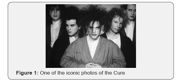
Under the main title of design there are many fields of production which corporates with it and will be many more from the time 17 years after getting in the new millennium, the 3rd. In Europe, America and Japan industrial revolution needed by the end of 18th century as a conclusion of mass production [1]. The products needed to a determination process before production as form and function. The relation of the two indispensables form and function re-defined and re-positioned by an art school named Bauhaus in Weimar, Dessau and Berlin, Germany in between 1919 and 1933 [2]. As a unique approach Bauhaus, combined arts and crafts and stated that form fallow function. The form fallow function principle associated with the 20th century design approaches of architecture and industrial design fields especially in United States [3]. While form as a noun is the visible shape or configuration -an arrangement of elements in a form, figure or combination of something-, and as a verb means bringing the parts together or combine to create something, function is to work or operate in a proper or way [4] (Figure 1).
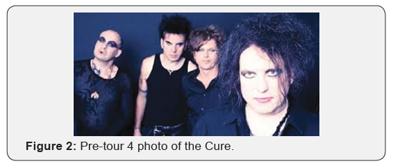
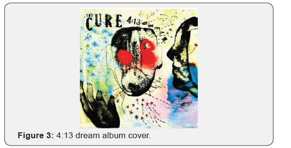
Graphic design as a design field is the pre-production determination of the printed 2d surfaces or a 2d reflected on a screen. In between many graphic design products album covers are the faces of music as a conjunction point in between two artistic language sound and image. Album covers both protect the recording medium and presents it to the audience as mean of recognition and expression. Recognition is the first function of an album cover design made by writing the name of the musician and the album with the help of some images related to (Figure 2). The second function is expressing a musical style, feeling or a mood visually with the help of a distinct design style. Like every design field graphic design has its own design elements and principles. Design elements like dot, shape, colour, value, texture, line qualifications, direction, organization attitude, repetition used according to the most effective and common six graphic design principles are unity / harmony, balance, hierarchy, scale / proportion, dominance / emphasis and similarity / contrast. Besides these, graphic design combines two types of expression on the same product [5,6] (Figure 3).
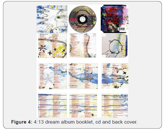
First type of expression is visual messaging by visuals like photograph or illustrations and verbal messaging with typographic elements like letters, numbers, punctuation, sign and symbols [7,8]. Every typographic element has two functions; one of them is to be read and the other one is to lay on the surface as a shape with its uniqueness. To be literal as function and harmonic as form the design of the typographic elements with the visuals is the success of graphic design (Figure 4). The aim of this book is to analyse 13 studio album covers of the British band the Cure with their typographic and visual elements according to the six main graphic design principles to determine the formal and contextual relation on.
The Band the Cure
The Cure is an English rock band formed in 1976 in Crawley, West Sussex. Since the formation they released 13 studio albums, 10 eps, more than 30 singles and have sold more than 27 million until. Dominant, melodic bass lines; whiny, strangulated vocals; and a lyric obsession with existential, almost literary despair used to describe their music. NME declared the Cure had during the 1980’s become “a goth hit machine (19), an international phenomenon and, yep, the most successful alternative rock band ever shuffled disconsolately about the earth”. The Cure won Brit Award in 1990 as the best video, in 1991 as the best British group; in 2009 NME Awards as Godlike Genius. In year 2000 Q Magazine the Seventeen Seconds album at number 65 in it’s the one-hundred greatest British album ever list, and it was in the book of the 1001 Albums You Must Hear Before You Die [9-14] (Figure 5).
The 4:13 Dream Album
The last studio album of the band the Cure has released in 2008 titles as 4:13 dream, which one is the thirteenth and labelled as alternative and indie rock [15]. Still using the term for all the albums of the Cure new wave is also used for this as in the form of new wave of the new wave, used for other bands also [16]. Smith did the vocal and work with a technique team as producer, mixer, engineer. While he played guitar, 6-string bass, and keyboards, Thompson played guitar, Gallup bass and Cooper drums. O’Donnell had already left the band. Additional musicians worked together as two bands Smud played extra percussion, and Cats field Sub Rhythm Trio accompanied with handclaps (Figure 6).
The last studio album of the band the Cure has released in 2008 titles as 4:13 dream, which one is the thirteenth and labelled as alternative and indie rock [15]. Still using the term for all the albums of the Cure new wave is also used for this as in the form of new wave of the new wave, used for other bands also [16]. Smith did the vocal and work with a technique team as producer, mixer, engineer. While he played guitar, 6-string bass, and keyboards, Thompson played guitar, Gallup bass and Cooper drums. O’Donnell had already left the band. Additional musicians worked together as two bands Smud played extra percussion, and Cats field Sub Rhythm Trio accompanied with handclaps (Figure 6). can be seen, one front, one side view, but still unrecognizable. Considered as male because it has no hair and any feminine curves and some black grains on chin as if beard. When looking in detail the unhappy lips can be seen in crimson red. In approximately places where his eyes and nose should be there are to crimson irregular shapes one round like an o and the other is looks like an uppercase B with a painted bowl. With other two stains on and under the profile right these are the only crimsons of the cover seen (Figure 7).
The schema is like a black print on a randomly water coloured paper with naturally grained. Watercolour effect made by pastel colours: light blue, light green, pale yellow and some lilac, familiar from the previous studio album cover. To build a colour balance, two diagonals used: one left without any colour but yellow, other made using blue with less green on top lefthand side and some with lilac bottom right-hand side. Besides colours texture as a design element is used widespread, meaning the way a surface feel or is perceived to feel. Stars made on top left create a beautiful night sky which resembles dreaming. The portrait seen from front attached with black thin dash lines to background, which is still the sky. While some dash lines going up from the head, other dash lines became arrows directs the viewer eye into the portrait. Then the same eye directed towards the types with the help of the stars in the sky.
The name of the band typed with a readymade typeface, which is bold but tall and agonic in both turnings and endings like the portrait is. The black typeface filtered as if the other black elements: diffusing and indefinite edges. The of the Cure separated and placed as a small crown on top of the C, which assists the ongoing curving movement of the eye. The rest lead the eye towards the title of the album, which bit by bit tilts. At the end of the title there is the profile looking toward. From the eye of it a dashed spiral ended as a star on the paper in his mind. At the end of the page after a water coloured blues and lilacs and a little bit of crimson red, as a black huge figure a hand seen with its fingers on strings. The blue lines taking off through the sky is the music playing. Finally, the loop ended on The Cure and turned back where it begins: crimson red eyes (Figure 8).
Rule of the thirds is working also both horizontal and vertical as seen on Figure 8. The types cover the first two boxes from top left. The Cure is as wide as the 1/3. The 4:13 dream is another 1/3. Left side of the two portraits, which is the sky with stars is 1/3. Under the two portraits, where the dashed lines are, is also 1/3. Hand is both covers 1/3 vertically and 1/3 horizontally. Because it is a piece of design and should only be aesthetic not precise, every measure is approximate.
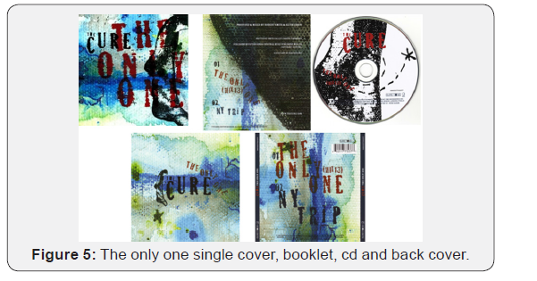
The Only One Single
The only one single album of the Cure released in 13th of May 2008. It consists two songs, one the single album named after the only one subtitled as the Mix 13 and other song called Ny trip. Labelled as rock as genre, new wave and indie rock as styles. Initially rock music based on the rock and roll of the 1940s and 1950s in the United States of America. Since the 1960s it gave birth into different styles locally and in the United Kingdom. The 1940s and 1950s rock and roll, influenced by the African American rhythm & blues and country music, which is a mixture of ballads and dance tunes played characteristically on banjo, fiddle, acoustic guitar, steel guitar, harmonica, drums and keyboard. What an interesting long and ongoing journey of music is depending on rhythm and blues, defined as African American folk music marked by strong beats and simple chord structure and the elements of blues dated back to the end of 19th century [17-20].
On the other hand, new wave is an umbrella term used to referred late 1970s-mid 1980’s pop / rock musical styles related to 1970s punk rock, which is a rock music marked by extreme and often deliberately offensive expressions of alienation and social disconnect -deep bounds with the name of the album-. New wave sound of the late 1970’s was something different from the smooth blues and rock & roll sounds to create music with a twitchy, agitated feel, choppy rhythm guitars and fast tempos. New wave has left its analogues techniques, which has since post-punk and began to incorporate electronic / experimental music, mod, disco, pop and engendered subgenres and fusions, including new romantic and gothic rock. On the other hand, postpunk as a style of rock music inspired by punk but less aggressive in performance and musically more experimental [21-23].
Alternative rock, the band the Cure known as is a genre of rock music that emerged from the independent music underground of the 1980s and became widely very popular with the 1990s. Alternative expressed primarily in a distorted guitar sound, subversive lyrics and generally apathetic, opposing, which is very suitable to this album of the Cure. As a part of the broader meaning, which now ended in only being alternative to anything, referred to a generation of musicians unified to either the musical style, or simply the independent, ‘do it yourself’ culture of punk rock, which laid the groundwork for alternative rock [24-27].
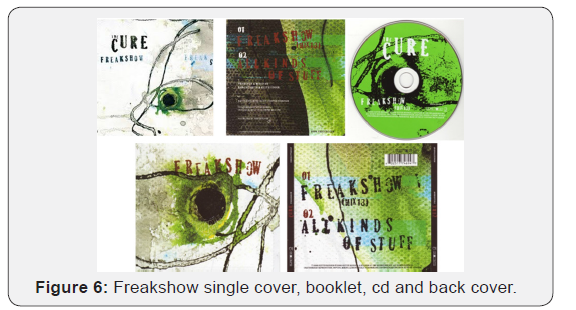
The Freakshow Single
The Freakshow single album of the Cure released in 13th of June 2008. It consists two songs, one the single album named after Freakshow subtitled as the Freak and an upside-down s and Mix 13 again and another song called All kinds of stuff. Labelled again as rock as genre, alternative rock as style. Alternative rock, the band the Cure known as is a genre of rock music that emerged from the independent music underground of the 1980s and became widely very popular with the 1990s. Alternative expressed primarily in a distorted guitar sound, subversive lyrics and generally apathetic, opposing, which is very suitable to this album of the Cure. As a part of the broader meaning, which now ended in only being alternative to anything, referred to a generation of musicians unified to either the musical style, or simply the independent, ‘do it yourself’ culture of punk rock, which laid the groundwork for alternative rock [24-27].
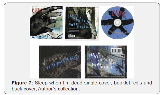
The sleep When I’m Dead Single
The Sleep when I’m dead single album of the Cure released in 13th of July 2008. It consists two songs, one the single album named after Sleep when I’m dead subtitled as the Mix 13 again and another song called Down under. Labelled again as rock as genre, alternative rock as style.
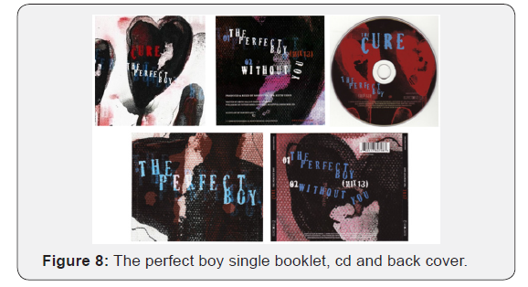
The Perfect Boy Single
The perfect boy single album of the Cure released in 13th of August 2008. It consists two songs, one the single album named after Sleep when I’m dead subtitled as the Mix 13 again and another song called Down under. Labelled again as rock as genre, alternative rock as style.


